AI Fashion Photography Prompts: From Outfit Description to Editorial Direction
Learn how to create better AI fashion images by combining styling, lighting, posing, composition, reference images, and iterative editing.
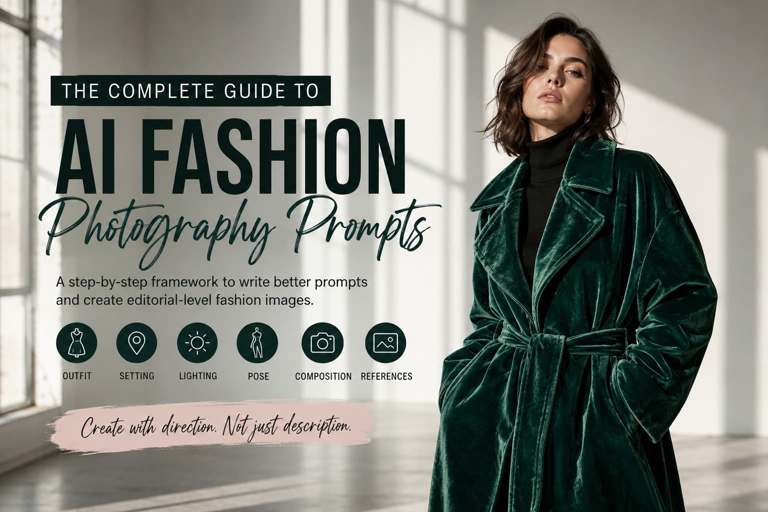
Anyone can prompt an AI image generator with "a woman in a red dress" and get an image back. Getting something that actually feels like a fashion editorial—with intentional styling, controlled lighting, a convincing pose, and a clear visual mood—is a different skill entirely. The real challenge isn't describing the clothes. It's learning how to direct the image.
That shift matters because modern AI image generation gives you more ways to shape a result than simply writing a longer prompt. You can guide the subject, styling, environment, lighting, composition, and pose, then use reference images or targeted edits when words alone aren't enough. The goal isn't to throw every possible detail into one prompt. It's to make the right visual decisions.
This guide walks through that progression step by step. We'll start with a simple outfit description, then build it into a complete fashion direction using styling, lighting, pose, composition, and camera language. We'll also look at when reference images and targeted revisions can help. By the end, you'll have a practical framework you can reuse for lookbooks, campaign concepts, editorial portraits, or your own fashion-focused image projects.
Level 1: The Outfit Description (Where Most People Start)
This is the baseline: simply telling the image generator what someone is wearing.
"A woman wearing a green velvet coat and black boots."
There's nothing wrong with starting here, especially when you're testing an outfit idea. But the prompt leaves almost everything else open. Who is the woman? Where is she? How is the coat styled? What is the lighting like? What is she doing? What should the image feel like?
When those decisions aren't specified, the image generator has to make them for you. The result may be perfectly usable, but it can also feel generic because there is no clear visual direction beyond the clothing itself.
That's why a simple outfit description is useful as a starting point, but it's rarely enough when you're aiming for a fashion editorial, campaign image, or polished lookbook.
Level 2: Add the Model and the Setting
Once the outfit is defined, give the image a person and a place to work with. This is where a simple clothing description starts becoming an actual fashion scene.
"A woman in her late 20s with shoulder-length dark hair, wearing an oversized sculptural coat in deep emerald green velvet, standing in a minimalist white studio."
Now the image has a subject with some identity and an environment that gives the outfit context. Instead of imagining a garment in isolation, the generator has more information about who is wearing it and where the photograph is taking place.
But we're still leaving some important creative decisions open. The prompt doesn't say how the scene should be lit, how the model should pose, or what kind of mood the photograph should have. Those choices can completely change how the same outfit looks.
That's the point of building a fashion prompt in layers. Each new detail should solve a specific visual decision rather than simply making the prompt longer.
Level 3: Lighting Does the Heavy Lifting
If an AI fashion image feels flat or generic, lighting is one of the first things to look at. Vague phrases such as "nice lighting" or "good light" leave too much open to interpretation. A specific lighting direction gives the image a much clearer visual character.
You don't need to become a professional photographer to use lighting in your prompts. Start by learning a few simple setups and, more importantly, understand the kind of result each one is meant to create.
- **Softbox lighting** — even, diffused light that works well for clean studio portraits and beauty-focused fashion images.
- **Butterfly lighting** — light positioned above and in front of the face, creating a small shadow beneath the nose and a classic glamour look.
- **Harsh directional light** — strong light from one direction that creates defined shadows and a more dramatic editorial feel.
- **Golden-hour light** — warm, low-angle natural light that works particularly well for outdoor fashion and lifestyle scenes.
- **Overcast light** — soft, diffused illumination that reduces harsh shadows and can create a clean, flattering outdoor look.
The important part isn't choosing the most complicated lighting setup. It's choosing one that supports the mood you're trying to create.
"A woman in her late 20s with shoulder-length dark hair, wearing an oversized sculptural coat in deep emerald green velvet, standing against a stark white studio background, strong directional side lighting creating defined shadows across the fabric."
Notice what changed. The outfit and setting are still essentially the same, but the lighting now tells the image generator how the scene should feel. The side light creates stronger contrast and gives the texture of the velvet somewhere to catch the light.
You can think of lighting as part of the story. Soft light can make a collection feel refined and approachable. Harder directional light can make the same clothing feel dramatic, edgy, or more editorial.
Level 4: Pose and Attitude
Clothes don't carry the whole image. The model's body language helps communicate how the clothing should feel. A simple standing pose can work, but if you leave the pose completely undefined, the result may feel static or disconnected from the editorial mood you're trying to create.
Instead of simply writing "standing," describe the body language you want. Think about posture, movement, where the model is looking, and the attitude the image should communicate.
"Pose is bold and dynamic, weight shifted onto one hip, chin slightly lifted, direct eye contact with the camera, strong confident expression."
This gives the generator several visual cues instead of leaving the entire pose open to interpretation. The weight shift creates asymmetry, the lifted chin changes the posture, and the eye contact gives the portrait a more confident presence.
"Caught mid-stride, coat flaring with movement, hair slightly windblown, candid energy rather than a posed stance."
The difference is subtle but important. The first direction creates a controlled editorial portrait. The second suggests a moment captured during movement, giving the image more of a fashion-story feel.
Neither approach is automatically better. The right pose depends on what you're trying to communicate. Use controlled posture for a polished campaign or studio portrait, and movement or candid body language when you want the image to feel more spontaneous and narrative-driven.
Level 5: Camera & Composition
Once the subject, styling, setting, lighting, and pose are working together, it's time to decide how the viewer should see the scene. This is where camera and composition language can make a noticeable difference.
You don't need to specify a camera body or a long list of technical settings every time. Think of camera language as visual direction. A lens reference can suggest a particular perspective, while framing and depth of field help determine what gets attention in the final image.
- **85mm lens** — often associated with a flattering portrait perspective and tighter subject framing.
- **50mm lens** — a natural-looking perspective that works well for portraits and environmental fashion scenes.
- **Shallow depth of field** — keeps attention on the model while allowing the background to fall softly out of focus.
- **Full-length framing** — useful when the clothing silhouette, footwear, and overall styling need to remain visible.
- **Low-angle composition** — can make the subject feel more imposing or dramatic.
- **Eye-level composition** — creates a more direct and natural relationship between the viewer and the subject.
For example, compare a prompt that simply says "fashion portrait" with one that tells the generator how the image should be framed:
"Full-length editorial fashion portrait, eye-level composition, 85mm lens, shallow depth of field, the entire outfit visible from head to foot, model sharply in focus against a softly blurred studio background."
The important part here isn't the camera specification by itself. It's the visual instruction around it. Saying that the entire outfit should remain visible, for example, gives the generator a much clearer idea of how the frame needs to be composed.
Camera and lens terminology can also behave differently across image generators, so treat these details as creative controls rather than guaranteed technical settings. If a particular lens reference isn't producing the look you want, describe the visual result directly instead—such as a compressed portrait perspective, a natural field of view, or a softly blurred background.
For fashion photography, composition is often just as important as the camera reference. Decide whether the image should be a close portrait, three-quarter shot, full-length frame, or wider environmental scene before adding technical details.
Level 6: Reference Images — When Words Aren't Enough
Sometimes you can describe an image clearly and still struggle to get the result you have in mind. This is where reference images can become useful. Instead of trying to describe every visual detail with words, you can give the image generator something concrete to work from.
For fashion projects, a reference image might help communicate the overall pose, styling direction, garment details, color relationships, composition, or visual mood. The important part is being clear about what you want the reference to influence rather than assuming the generator will interpret it exactly the way you do.
For example, you might provide a reference for the pose while describing a completely different outfit in the prompt:
"Use the reference image for the model's pose and overall framing. Create a new fashion look with an oversized emerald velvet coat, black turtleneck, and knee-high boots. Keep the pose and camera perspective similar while changing the styling, setting, and color palette."
This is different from simply saying "make it look like the reference." You're telling the generator which part of the reference matters and which parts should change.
- **Pose reference** — use an image to communicate body position, gesture, or movement.
- **Styling reference** — useful when the clothing silhouette, layering, or overall fashion direction is difficult to describe.
- **Composition reference** — helps communicate framing, subject placement, or the relationship between the model and the environment.
- **Lighting reference** — can provide a visual target for the direction, softness, or contrast of the light.
- **Mood reference** — useful when the overall atmosphere is easier to show than to explain.
Reference images don't remove the need for a good prompt. They work best when you combine the visual reference with clear instructions about what should be preserved, what should change, and what the final image needs to communicate.
Think of a reference image as another form of direction. Instead of describing every visual decision from scratch, you're giving the model a starting point and then explaining how you want to reinterpret it.
Level 7: Full Editorial Direction — Putting It All Together
At this point, you're no longer just describing an outfit. You're directing a fashion shoot. The subject, styling, setting, lighting, pose, and composition all need to work together so the image feels like one intentional visual concept.
You don't need to include every possible detail in every prompt. The goal is to give the image generator the decisions that actually matter for the shot you're trying to create.
Here's what that looks like when the pieces come together:
"High-fashion editorial portrait of a woman in her late 20s with shoulder-length dark wavy hair and minimal makeup with a defined brow, wearing an oversized sculptural coat in deep emerald green velvet over a black turtleneck. She stands in a minimalist white studio under strong directional side lighting that creates defined shadows across the velvet texture. Her weight is shifted onto one hip, chin slightly lifted, with direct confident eye contact. Full-length vertical composition, the entire outfit visible from head to foot, model sharply in focus against a softly blurred studio background, refined magazine-style fashion photography."
Notice how each part of the prompt has a job. The subject establishes who we're looking at. The styling defines the clothing. The studio creates the environment. The side lighting shapes the scene. The pose establishes attitude. And the full-length composition tells the generator what needs to remain visible in the frame.
That's the difference between adding detail and adding direction. A long prompt isn't automatically a good prompt. What matters is whether the details work together to create one clear visual idea.
You can also use a reference image at this stage when you already have a specific pose, composition, or visual treatment in mind. In that case, explain what the reference should influence and what you want to change rather than simply asking the generator to copy the entire image.
Level 8: Refine Instead of Rewriting Everything
Even a well-planned prompt rarely produces the perfect fashion image on the first attempt. That's normal. The mistake is assuming that every imperfect result means you need to start over from scratch.
Look at the image and identify the one thing that is actually wrong. Maybe the lighting is too soft, the pose feels stiff, the background is distracting, or the outfit isn't being shown clearly enough. Then change that part while keeping the rest of the direction intact.
"Keep the model, outfit, pose, lighting, and camera perspective unchanged. Change only the background to a dark charcoal studio backdrop."
That's much more useful than rewriting the entire prompt and hoping the next generation fixes the problem. When you isolate the change, you can better understand what improved the image and what didn't.
- **Problem: The pose feels stiff** — Change the body language or introduce subtle movement while keeping the styling and lighting.
- **Problem: The outfit isn't fully visible** — Adjust the framing to a full-length composition without changing the rest of the scene.
- **Problem: The lighting feels flat** — Strengthen the direction or contrast of the light while preserving the subject and setting.
- **Problem: The background competes with the model** — Simplify the environment or reduce its visual detail.
- **Problem: The overall mood feels wrong** — Adjust the lighting, color relationships, or environment instead of adding more unrelated adjectives.
A useful workflow is simple: generate the image, inspect the result, identify one problem, make one targeted change, and compare the new result with the previous version. Repeat until the image moves closer to the original creative direction.
The goal isn't to find a magical prompt that works perfectly on the first try. Good image creation is often an iterative process, and learning to make controlled revisions is part of becoming better at prompting.
A Quick Framework You Can Reuse
When you're staring at a blank prompt box, don't try to describe everything at once. Walk through the visual decisions one by one. You won't always need every layer, but knowing what each one controls makes it easier to build a prompt with intention.
- **Who** — define the subject, general appearance, expression, or character.
- **Wearing what** — describe the garment, fabric, color, silhouette, and important styling details.
- **Where** — choose the studio, street, landscape, interior, or other environment.
- **Lit how** — decide what kind of light shapes the scene and supports the mood.
- **Posed how** — describe body language, movement, posture, eye contact, and attitude.
- **Framed how** — decide whether you want a close portrait, three-quarter shot, full-length frame, or wider environmental composition.
- **Referenced or constrained how** — if you're using a reference image or editing an existing result, explain what should influence the image and what should remain unchanged.
Think of these as creative controls, not a checklist you must fill out every time. A simple studio portrait may only need a subject, outfit, lighting, and framing. A campaign concept might need all seven layers plus a reference image.
The goal is not to make your prompts longer. It's to make your visual decisions clearer. If a detail doesn't help communicate what you want the viewer to see, you probably don't need it.
Common Mistakes to Avoid
- **Relying on vague words like "beautiful" or "stylish."** These words don't tell the image generator what should actually change. Describe something visual instead: the fabric, silhouette, lighting, pose, color, or composition.
- **Adding detail without adding direction.** A longer prompt isn't automatically a better prompt. Every detail should have a visual purpose.
- **Skipping lighting.** If the image feels flat or lacks atmosphere, look at the lighting before adding more adjectives.
- **Forgetting the frame.** If the clothing needs to be visible from head to foot, say so. Composition and framing can have a bigger impact than adding another style keyword.
- **Treating camera settings as mandatory.** Lens and camera terminology can be useful creative controls, but they won't behave identically across every image generator.
- **Mixing too many visual directions.** Combining several unrelated aesthetics, lighting styles, or moods can make the result feel confused. Choose a clear visual direction first.
- **Using a reference image without explaining what it should control.** Tell the generator whether the reference is for the pose, styling, composition, lighting, or overall mood, and specify what should change.
- **Changing everything between generations.** If the first result is close, identify the one thing that's wrong and change that instead of rebuilding the entire prompt.
- **Expecting the first generation to be perfect.** Strong image creation usually involves testing, comparing, and refining. Treat the first result as information you can learn from.
The common thread behind these mistakes is simple: don't make the generator guess about decisions that matter to your image, but don't bury the important decisions under unnecessary detail either. Good prompting sits somewhere between the two.
Where to Take This Next
Once this framework starts to feel natural, the fun part is experimenting with the individual pieces. Keep the same emerald velvet coat, for example, and move the shoot from a clean studio to a rain-soaked street at night. Swap soft studio light for hard directional flash. Change a confident pose into something quieter and more candid. The structure stays familiar, but the visual story changes completely.
You can also start working with reference images when you have a specific pose, composition, or visual treatment in mind. Instead of trying to describe every detail from scratch, use the reference to communicate the part that's difficult to put into words, then use your prompt to direct what should change.
And when the result is close but not quite right, don't immediately throw the whole prompt away. Keep what is working and make one focused adjustment. Change the lighting, refine the pose, simplify the background, or adjust the framing. Small, deliberate revisions can take an image much further than endlessly adding more adjectives.
Fashion prompting rewards the same instinct a good photographer or creative director uses on a real shoot: think about the whole image, not just the outfit. Once you're directing the subject, styling, environment, light, composition, and mood as parts of the same visual idea, your prompts become more intentional—and your results have a better chance of feeling like a finished fashion image rather than a collection of generated details.